Pets N' Stuff
eCommerce for Small Business: A Case Study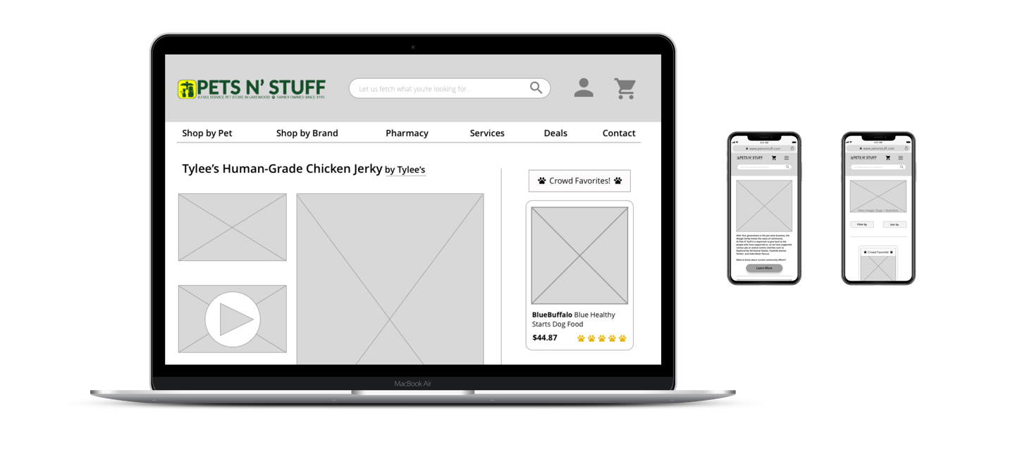
As a solitary UX researcher and designer I had the chance to propose a new ecommerce experience for Pets N’ Stuff, Lakewood, Colorado’s local pet store. Priorities were to feature the store’s local nature and four generations of experience as I added a streamlined online shopping experience for users.
Logistics
- Team of One
- Platform: responsive website
- Sketch App (wireframes)
- InVision (prototype)
Constraints
- Duration: 2 weeks
- Expand beyond dogs & cats
User Interviews
- 6 Users
- Ages 26-45
- Remotely via Zoom
- Pet owners who shop online
- Affinity Map
- Journey Map
Competitors
- 3 major competitors
- Chewy, Petco, Petsmart
- Feature Analysis
Testing
- 1 Round of Usability Testing
- 3 Users
- Ages 25-40
- Unmoderated via Zoom
- Card Sorts: Open & Hybrid
Discover
Beginning this solo project, I dove into understanding what the current experience was for those visiting petsnstuff.com as well as understanding the industry and user expectations. A good place to start was seeing what customers had to say in their reviews…
“The best pet store in town. When we walked in we were greeted with a smile and the lady at the cash register was very helpful…Thank you! Best Customer service ever.”
“Great family owned store, great selection of food, toys and training tools. Friendly service. Clean grooming area!”
“First time in. Delighted with the selection. A socialization opportunity for my pup and a bag of frozen rib bones. We will be back.”

Pets N’ Stuff Facebook Reviews
After Pets N’ Stuff took down their online store…
“I would absolutely prefer to support an independent small business, being one myself, but when that’s not possible I choose based on “other factors” if you catch my drift.”
“The food my dog is on isn’t sold locally. Chewy and Pets n Stuff were the only online places I could find it. So now I get it from Chewy.
“Chewy doesn’t carry my food so (now) I buy direct from Fromm.”
The User’s Emotional Journey
In order to get a sense for how a user would encounter the current petsnstuff.com, I proceed through the site crafting a retrospective journey map. The current site has remnants of when it was an online store in how it’s laid out, though it is no longer a store. It’s frustrating to find items they may carry only to end up having to call or visit in person. Furthermore users simply get lost with redundant navigation leading to different places and no search bar function.

Disappointed

Frustrated

Lost
Learnability
Redundant navigation scattered around homepage makes learnability a challenge.
Efficiency
Brand navigation button clear + upfront in global navigation. Proves to be an industry standard.
SATISFACTION
A website that doesn’t serve users the value add of new info or ecommerce risks falling behind competitors like Chewy.
Expert Perspective
To gain great understanding for the website and its current functionality, I performed a personal heuristic evaluation in the LEMErS model: Learnability, Efficiency, Memorability,
Error Management, Satisfaction.
Meet the Competition
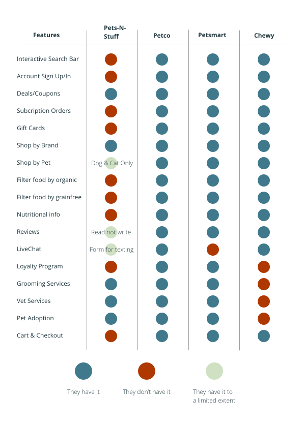
A crucial part of the puzzle is understanding where Pets N’ Stuff falls within the industry competitors. Doing competitive analysis also highlights potential opportunities in witnessing what the top competitors may be doing really well as well as where they may be falling short of user needs.
From this I see that Pets N’ Stuff holds their own on services against the big leagues. All that seems to be missing is their eCommerce platform with efficient filterability in searching. Now it’s time to meet the users to see what they really need!
Define
Rounding out the research phase of the project, it’s time to distill insights and define the users and the problems that plague them. From data to analysis…here we go!
Two User Personas
Experienced Pet Owners vs First-time Pet Owners
Customer Reviews
Key to avoiding purchasing the wrong item
In-Person
For some items and for expert advice, shoppers still prefer shopping in-person
Affinity Map Takeaways
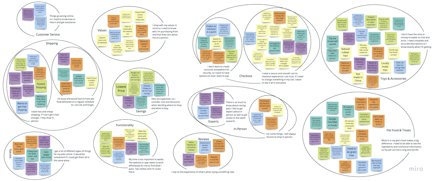
After conducting six remote user interviews via Zoom, I synthesized the resulting insights using an Affinity Map.
Who are the users & What’s Important to them?
After teasing out the research, it was time to define my two user personas a bit more.
Who are the users?
After conducting six remote user interviews via Zoom, I synthesized the resulting insights using an Affinity Map.
What’s Important to them?
After teasing out the research, it was time to define my two user personas a bit more.
Two User Personas
Experienced Pet Owners vs First-time Pet Owners
Customer Reviews
Key to avoiding purchasing the wrong item
In-Person
For some items and for expert advice, shoppers still prefer shopping in-person

Meet Adam | Primary Persona
Experienced Pet Parent| 50 year-old School Teacher
As a devoted doggie dad, Adam does all he can to ensure his little guy,
Norman, lives a full and healthy life. He knows exactly what he needs for
his dog, so he shops online for convenient delivery.
Adam hates when he can’t customize his search to find what he is looking for without scrolling.
When he has to go through several pages during checkout, he starts to distrust the process.

Meet Annie | Secondary Persona
First-Time Pet Parent| 24 year-old Tech Intern
As a busy intern, Annie can’t keep up with the endless list of contradicting articles on what she should and should not do for her cat. So far it’s been a lot of annoying trial and error with a fair amount of doubt.
Annie needs guidance from other cat owners as well as experts so she can feel confident in what she gets for Sweetie.
She gets frustrated when there aren’t helpful reviews to help guide her cat gear purchases.
The Opportunities
While creative problem solving for Pets N’ Stuff’s eCommerce site, the users always remain front of mind.
Adam needs an intuitive customizable shopping experience with streamlined checkout because he knows exactly what he wants and doesn’t want his leisure time wasted with the confusing minutiae of an online shop.
How might we make perusing products more customizable and enjoyable?
How might we speed up the checkout process for ease and efficiency?
Annie needs access to pet experts and experienced pet owners because she’s new to owning a cat and feels lost without guidance.
How might we tie the shopping experience in with the shop’s Nutritional Counseling online?
Finding Navigation
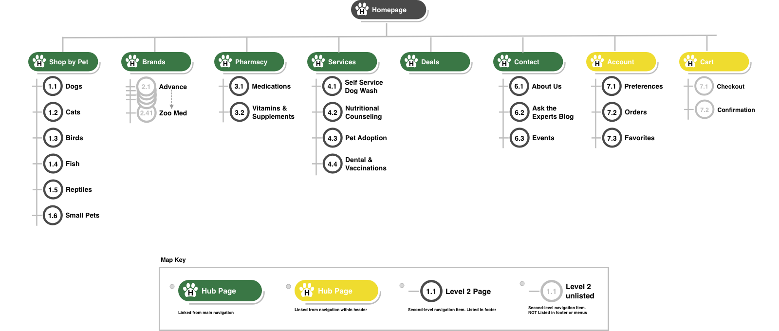
In crafting the new sitemap to organize the information architecture for Pets N’ Stuff, I needed to get a sense for how the average pet owner considered their products. I conducted two card sorting exercises – one open and one a hybrid where some categories were provided as users could also add their own.
Some major categories presented themselves as well as a depiction of the need for greater filter customization in lieu of extensive, potentially confusing, categorization. This was also supported in competitive research done on the site navigation of Chewy, Petsmart, and Petco. Ultimately the research all pointed to Shop by Pets with subcategories Dogs, Cats, Birds, Small Pets, Fish, and Reptiles, in addition to Shop by Brand.

Finding Navigation
In crafting the new sitemap for Pets N’ Stuff, I needed to get a sense for how the average pet owner considered their products. I conducted two card sorting exercises – one open and one a hybrid where some categories were provided as users could also add their own. Some major categories presented themselves as well as a depiction of the need for greater filter customization in lieu of extensive, potentially confusing, categorization. This was also supported in competitive research done on the site navigation of Chewy, Petsmart, and Petco. Ultimately the research all pointed to Shop by Pets with subcategories Dogs, Cats, Birds, Small Pets, Fish, and Reptiles, in addition to Shop by Brand.
Design
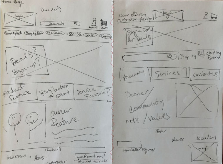
Designing for Adam & Annie
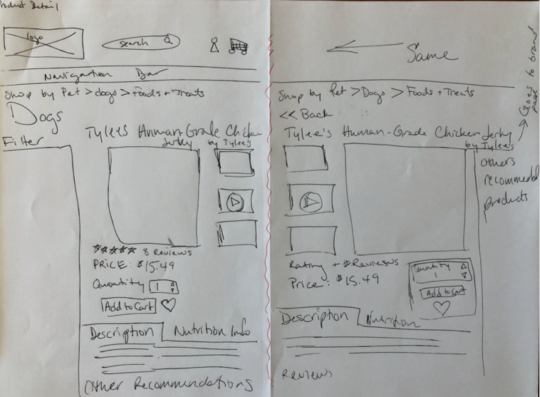
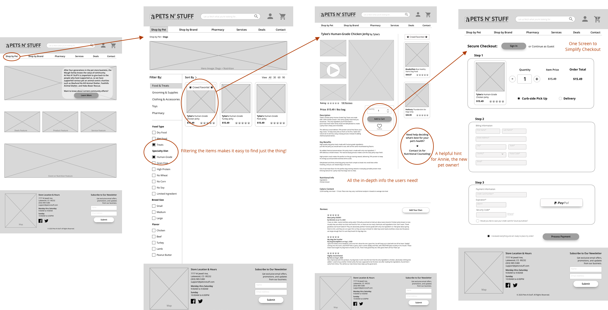
Working from a modular approach to web design, I hand sketched several idea iterations of home pages, product list pages, and product detail pages to help flush out the page layout and features. As the pieces began to take shape, I moved digital where it would be easy to design the elements of the site while still testing position and layout.
Usability Testing
In the usability testing, three users were administered an unmoderated test with the following scenario and task:
You want to get your pups a special treat, namely Tylee’s Human-Grade Jerky from your local pet store’s website, Pets-N-Stuff.com. Please proceed through the site to locate that item and add it to your cart and checkout.
Test Navigation
All three pet owners were able to speedily navigate through the site to checkout with human-grade jerky treats.
Search Bar
66% of those tested would have desired to use the search bar function rather than navigate through the site.
Scroll No Go
If not using search bar, then they would choose to use the Shop by Brand before Shop by Pet – the flow being tested. They confessed that they thought there would be too much to scroll through in Shop by Pet.
Filter Fun
All found the filtering and sorting to be key to their ease in searching. Endless scrolling would be a pain point.
Quotes of Note
Looking at the Product Detail page:
I consider images first, then reviews, and then price. I know things for pets are expensive, so I need those two other things to hold up first.
Regarding the Account function:
I would need to use the store 3 times in a 6 month period to join. A one off purchase from a Google search, I wouldn’t sign up.
Upon arriving on the Checkout page:
Before even considering ordering, I would need to know what the shipping situation is – speed and cost. If it’s too much or too long, I’m not shopping there.
Deliver
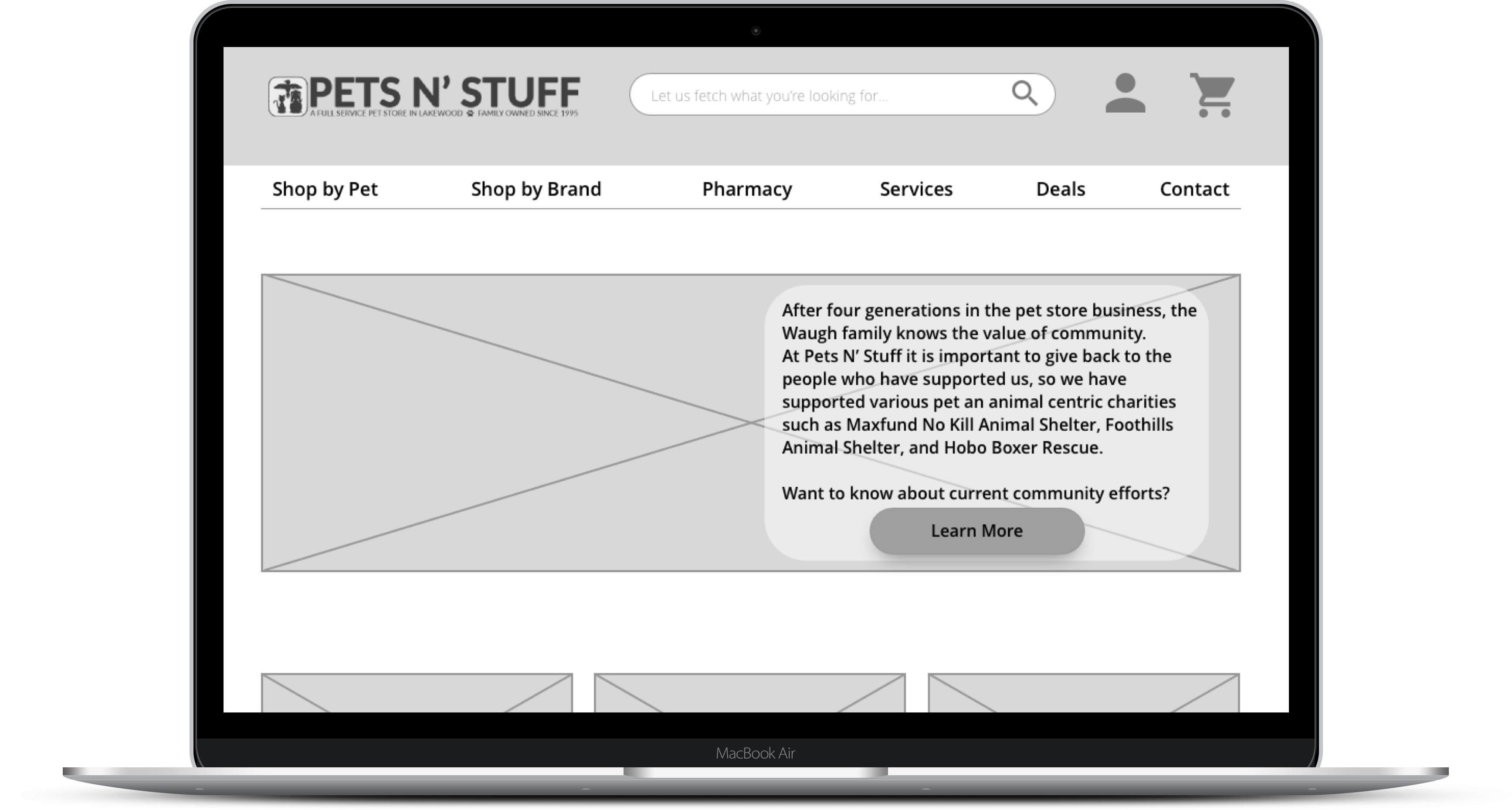
Mid Fidelity Wireframes
Grayscale mid-fidelity wireframes were present via InVision clickable prototype traveling through Adam’s path along this user flow.
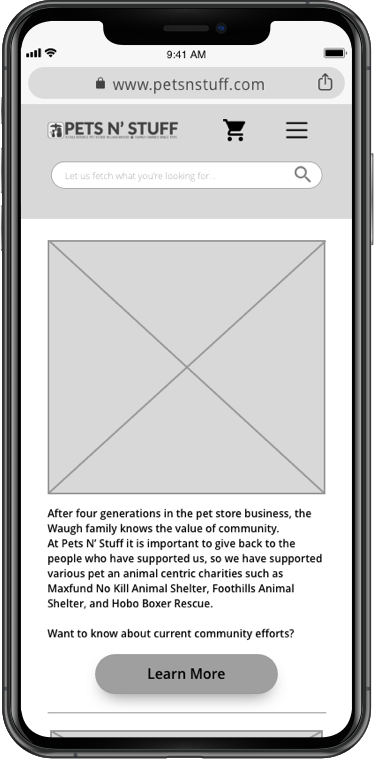
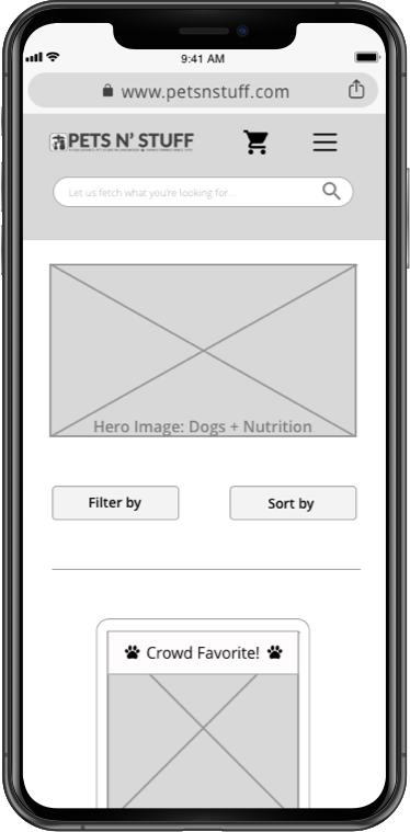
Mobile Wireframes
Considering the website’s mobile responsiveness was key to providing for the user’s need for ease across devices.
Mobile Home Screen
Modules move into a single column for easy viewing on smaller screens.
Mobile Products Screen
Considering the website’s mobile responsiveness was key to providing for the user’s need for ease across devices.
Mobile Wireframes
Considering the website’s mobile responsiveness was key to providing for the user’s need for ease across devices.
Mobile Home Screen
Modules move into a single column for easy viewing on smaller screens.

Mobile Products Screen
Considering the website’s mobile responsiveness was key to providing for the user’s need for ease across devices.

Mobile Checkout Screens
The ease of the one-page checkout screen on the computer browser becomes a frustrating overpacked single screen on mobile. As a result, the responsive site transforms to be three simple screens on mobile devices.


Next Steps
The ease of the one-page checkout screen on the computer browser becomes a frustrating overpacked single screen on mobile. As a result, the responsive site transforms to be three simple screens on mobile devices.
Mobile Testing
Prepare a mobile responsive prototype for usability testing.
Does the ease of use transfer on the go?
Account Set Up
Build out account set-up user flow and features for usability testing. Easeful set-up for members is crucial to increase rate of conversion.
Shipping Info
Add delivery time estimation and shipping rate information for users that find that to be a make-or-break piece of intel.
Thoughts of Annie
Work with Pets N’ Stuff Services to build out support and nutritional user flows for Secondary Persona. How might we support a new pet owner who needs more guidance and expert advice?
Thank you!
I really appreciate you taking the time to learn about how I work. Feel free to learn more about me or reach out to connect about this project or a brand new one!
