Motivate
The Winning Social Platform for #RemoteTogetherness: A Case Study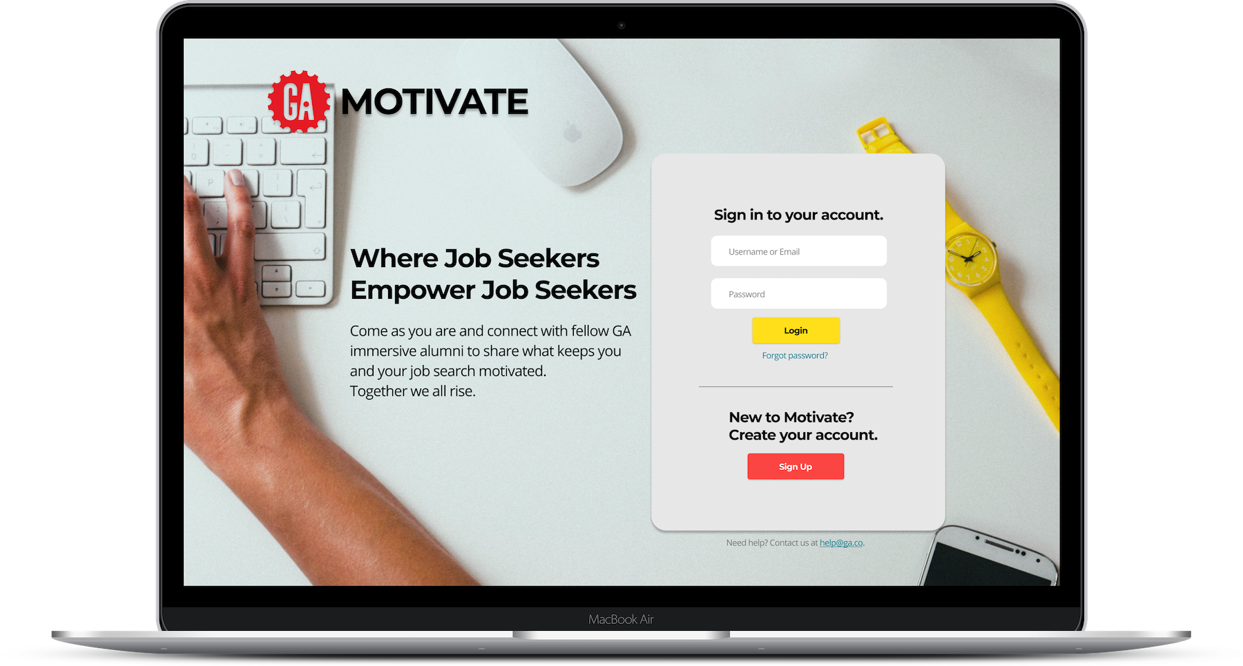
Once upon a dark December, two UX Designers, three frontend developers, and three backend developers were randomly paired together as one of a handful of alumni teams from General Assembly’s User Experience Design Immersive and Software Engineering Immersive tracks. The theme they would be solving for: #RemoteTogetherness. The time they had to design and build: 3 days (10amET – 6pmET). Things got real. Engineers talked about vulnerability. Designers probed to find the depth of their perspectives. Everyone collaborated to create GA Motivate: a safe place for job seekers to empower job seekers. Designing, building, and deploying this product was a wild ride. To win was truly humbling.
Logistics
- Duration: 3 days
- Dispersed 8-person team
- Platform: responsive website
- Figma (designs), Heroku App (demo)
The Team
- 2 User Experience Designers
- 3 Frontend Developers
- 3 Backend Developers
- Multiple time zones via Zoom & Slack
Judging Criteria
- Design: is it intuitive and delightful
- Features: how thoughtfully conceived
- Build: what is the level of fidelity/functionality
- Practical: how useful is the product
- Pitch: how well did you sell it
Our Assumptions
- Users: GA Alumni
- Aged 20-40
- Job Seekers
- Build for desktop: job seekers hunt via desktop over mobile.
Lessons
- Design: Dream Big
- Build: What’s Possible
- Everyone is a Designer
- Communication is Key
Discover
Working against the clock meant hitting the ground running. We brainstormed every form of remote connectivity we could think of – everything from games to video chat to social media. From there however we brought it down to a more personal level. I wanted to resist the urge to just start designing something from nothing, so I focused my attention on an easy user group to interview, ie. the team itself. My UX partner Esteban and I turned inward to the group to run some pseudo user interviews. Looking to the software engineers as potential users, what was their experience recently with connectivity and feelings around “remote togetherness” in general?
Define
How and why are users connecting?
After connecting with our users, recent GA alumni currently on the job hunt, we learned that the greatest opportunity for increasing #remotetogetherness would be something that could solve for the isolation and struggle involved in being a job seeker.

Now put that job seeker in a global pandemic that has claimed over 1 million people. Now put that job seeker in an economy with over 10 million unemployed workers. The loneliness, depression, and anxiety increase tenfold.
What is the current experience?
A few main themes presented themselves:

Slack App
Often too broad. Can become overwhelming and things get lost or missed.
Not personal enough. Seems phony as people try to impress employers.

Other Social Media
Not specific to the reality of the job seeker’s lived experience.
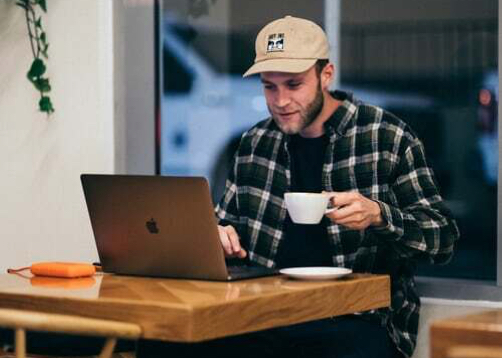
Meet Ripley | Proto Persona
GA Alumni Software Engineer | 27 year-old
From our preliminary research efforts, we created a proto persona to help guide our designs as we solved for his particular pain point.
Ripley is a recent bootcamp graduate from General Assembly and is hunting for a job as a backend developer. He misses going to his favorite coffee shop to work and is feeling pretty isolated.
He needs a way to gain motivation. He wants to have a feeling of community and support.
He wants a way to connect over shared experiences in the job hunt.
He needs a safe place to praise and be praised, and ask questions without pretension.
The Opportunity
To keep us focused on the why for our creation we crafted the following problem statement:
Ripley needs a way to connect with job seekers with shared experiences to be able to stay motivated because job searching in a pandemic can be isolating and fatiguing.
How might we create a space where users will be vulnerable and real?
How might we make a community for a specific type of job seeker?
Design
Designing for Ripley
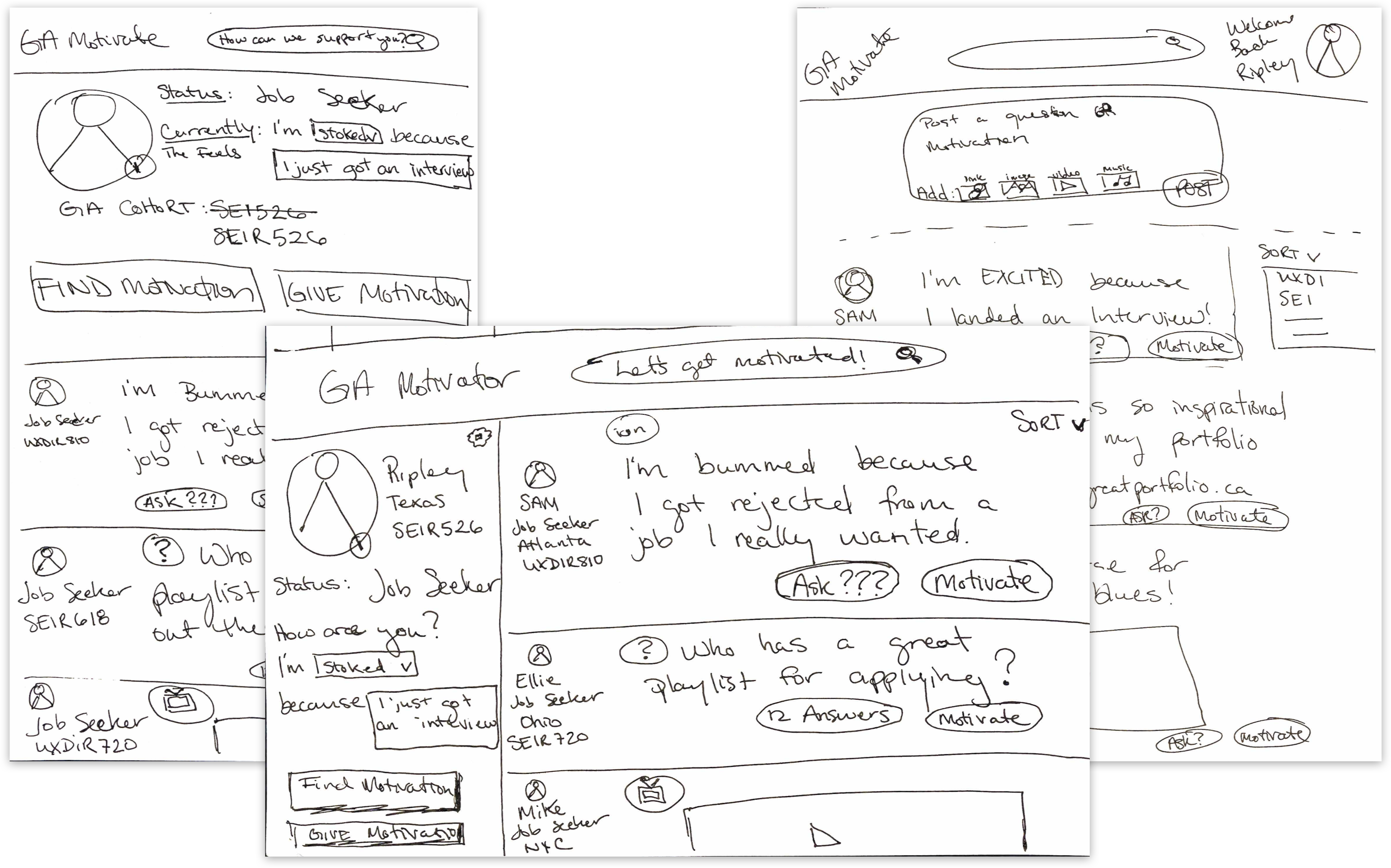
We began with a Design Studio as a team – a brief workshop to brainstorm ideas via short timed sketching exercises around our problem statement. Even though many engineers were a bit resistant, I empowered them to consider their input as valuable. They might not be artists, but they are designers and how they experience the world is valuable.
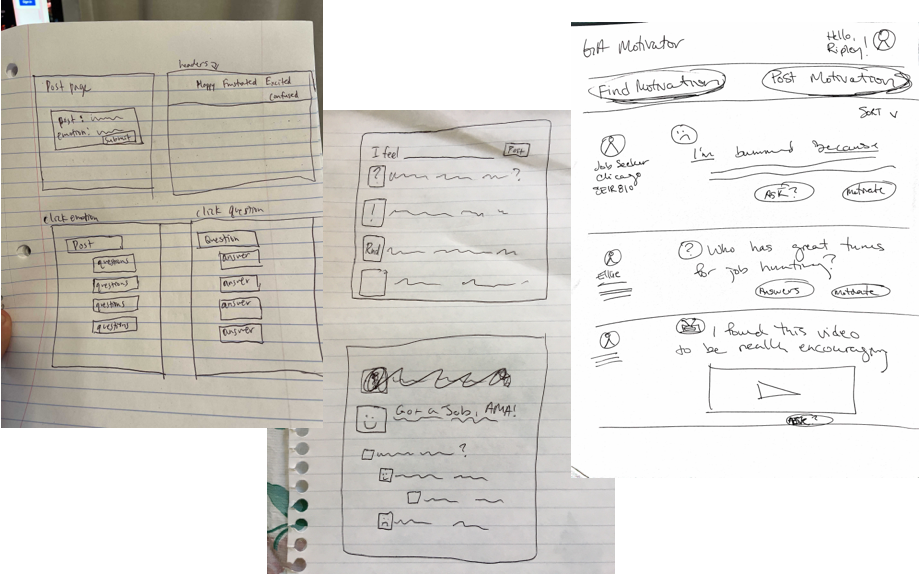
Design Studio Takeaways
Instant Praise
Avoid instant praise features such as Like/Love icons or social metrics like friend totals. These promote competition and comparison thinking.
Ask Questions
Encourage users to ask questions to further deepen conversation.
Do Less
Keep it simple. Less but better.
Going Digital
We iterated on layout and features as we finalized hand sketches and then moved into Figma to digitize wireframes.
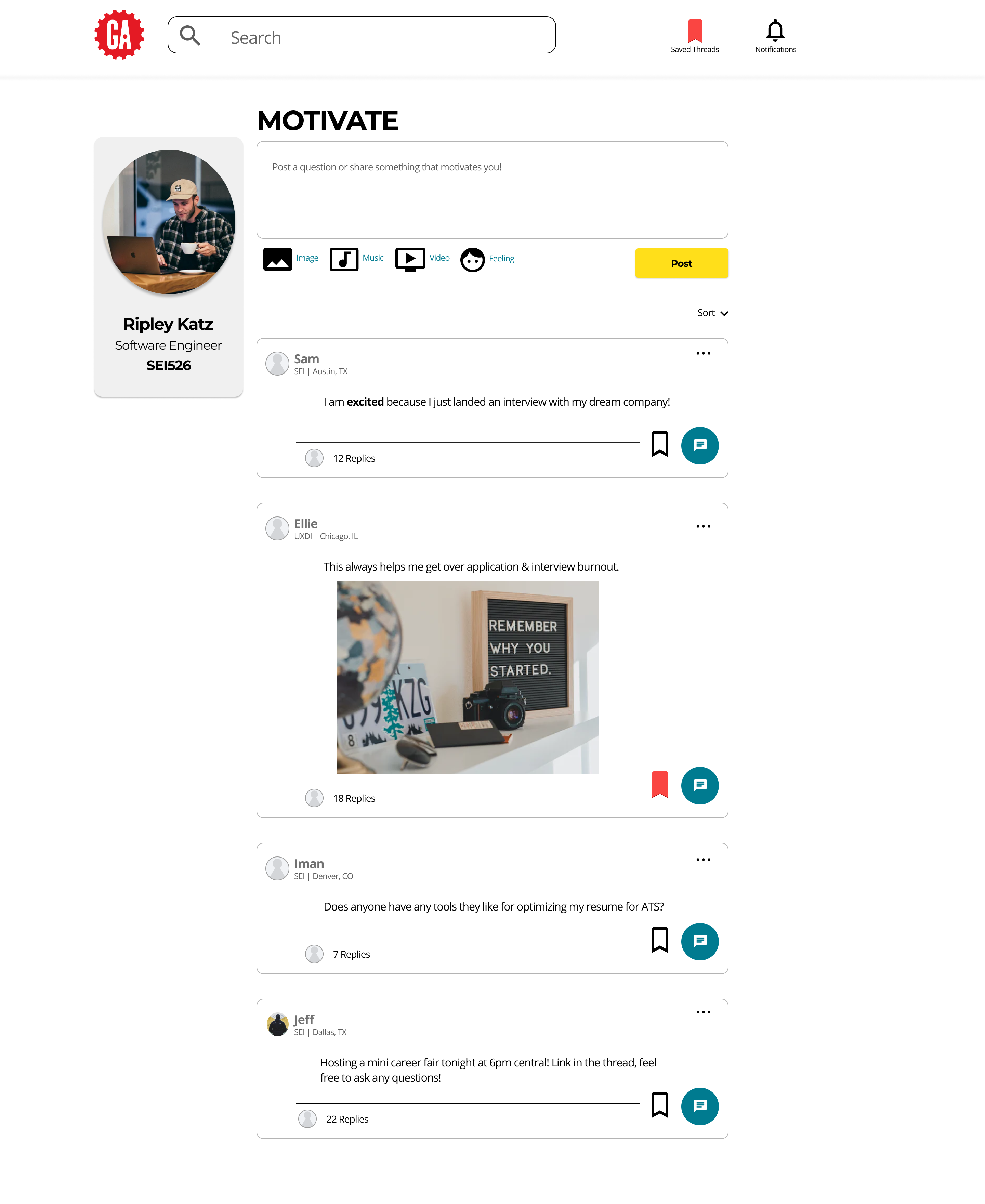
With time of the essence, we moved as quickly into high fidelity wireframes with full color, making choices decisively so that our frontend developers could start building the CSS. We built out a design system as we went to keep consistency (as well as ease).
Feature Function Check-in
Working in such a tight timeline, meant we needed to work very agile, constantly checking in for feedback to make sure things weren’t deviating from reality. While we as designers did ultimately design things our team said they would have needed more than three days to build, we continually calibrated our MVP (minimum viable product) designs based on the feedback from the developers.
Designers dream big, but engineers can only build what is possible given the restraints. To succeed in the challenge, we needed to work together to balance the two.
Iterations
Even moving quickly there is time to smartly iterate, even make some bold choices late in the game as long as it’s low effort for your engineers. This is why it’s great to stay in communication so you know what’s possible!
Sometimes a low effort change for developers can mean a high impact change for users.

Build
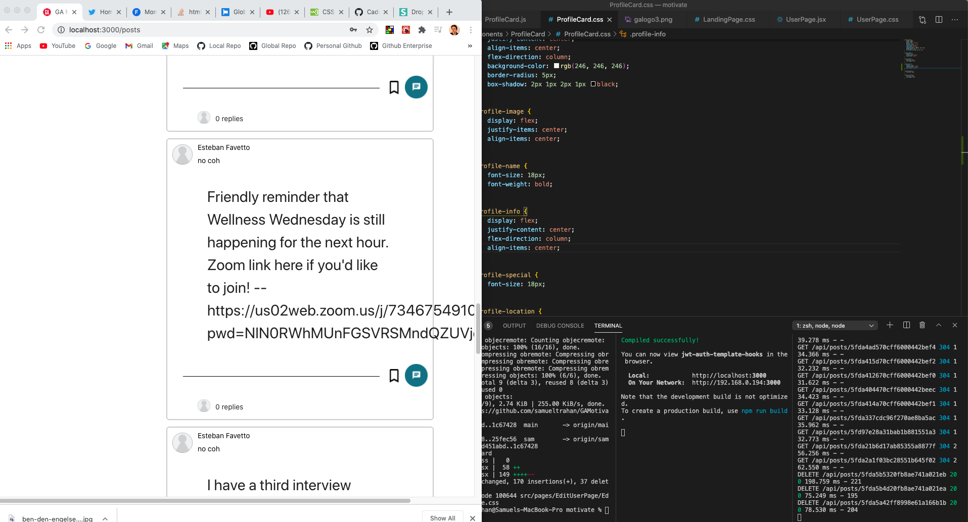
The team of software engineers worked speedily coding functionality. They worked collaboratively with each other to build out the backend databases as well as code the frontend CSS.
Deliver
High Fidelity Wireframes
As designers, we scrubbed up the prototype to convey final ideas and exported the assets for the engineers. We then turned our focus to the presentation as the developers went heads down and took us home.

Presentation & Demo
The hour arrived for our presentation. Our GA Motivate was deployed in record time on Heroku for our functional demo.
The rest as they say is history.
Our design and build was praised for its specificity and ingenuity. That said, we got some great encouragement from our judges on where we could go next…
Next Steps
Community Growth
How might we engage a larger community than GA?
Could GA Motivate be rebranded for other bootcamp type programs?
Roadmap
The feature roadmap includes things like saved post functions and threaded conversations. Accepting a simple MVP is hard, but with a robust design comes an exciting roadmap. And oh, the places we’ll go.
Thank you!
I really appreciate you taking the time to learn about how I work. Feel free to learn more about me or reach out to connect about this project or a brand new one!
